|

by Frank Jacobs
May 22, 2019
from
BigThink Website
-
Map details dramatic shift from CNN to Fox News
over 10-year period
-
Does it show the triumph of "fake news" - or,
rather, its defeat?
-
A closer look at the map's legend allows for
more complex analyses
Dramatic
and misleading
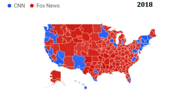
Image: Reddit / SICResearch
The situation today:
CNN pushed back to
the edges of the country.
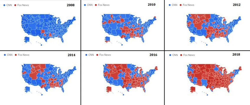
Over the course of no
more than a decade, America has radically switched favorites when it
comes to cable news networks. As this sequence of maps showing TMAs
(Television Market Areas) suggests,
CNN is out, Fox News
is in....
The maps are certainly
dramatic, but also a bit misleading.
They nevertheless provide
some insight into the state of journalism and the public's attitudes
toward the press in the US.
Let's zoom in:
-
It's 2008, on the
eve of the Obama Era, CNN (blue) dominates the cable news
landscape across America. Fox News (red) is an upstart
(°1996) with a few regional bastions in the South.
-
By 2010, Fox News
has broken out of its southern heartland, colonizing markets
in the Midwest and the Northwest - and even northern Maine
and southern Alaska.
-
Two years later,
Fox News has lost those two outliers, but has filled up in
the middle: it now boasts two large, contiguous blocks in
the southeast and northwest, almost touching.
-
In 2014, Fox News
seems past its prime. The northwestern block has shrunk, the
southeastern one has fragmented.
-
Energized by
Trump's 2016 presidential campaign, Fox News is back with a
vengeance. Not only have Maine and Alaska gone from entirely
blue to entirely red, so has most of the rest of the U.S.
Fox News has plugged the Nebraska Gap: it's no longer
possible to walk from coast to coast across CNN territory.
-
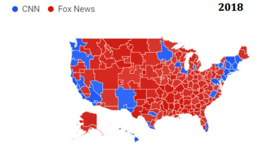
By 2018, the
fortunes from a decade earlier have almost reversed. Fox
News rules the roost. CNN clings on to the Pacific Coast,
New Mexico, Minnesota and parts of the Northeast - plus a
smattering of metropolitan areas in the South and Midwest.
"Frightening
map"

Image source: Reddit / SICResearch
This sequence of maps, showing America turning from blue to red,
elicited strong reactions on the Reddit forum where it was published
last week.
For some, the takeover by
Fox News illustrates the demise of all that's good and fair about
news journalism.
Among the comments?
For others, the maps are
less about the rise of Fox News, and more about CNN's self-inflicted
downward spiral:
-
"LOL that's
what happens when you're fake news!"
-
"CNN went down
the toilet on quality"
-
"A Minecraft
YouTuber could beat CNN's numbers"
-
"CNN has become
more like a high-school production of a news show"
Not a few find fault with
both channels, even if not always to the same degree:
-
"That anybody
considers either of those networks good news sources is
troubling"
-
"Both leave you
understanding less rather than more"
-
"This is what
happens when you spout bullsh** for two years straight.
People find an alternative - even if it's just different
bullsh**"
-
"CNN is sh** but
it's nowhere close to the outright bullsh** and baseless
propaganda Fox News spews"
"Old people
learning to Google"
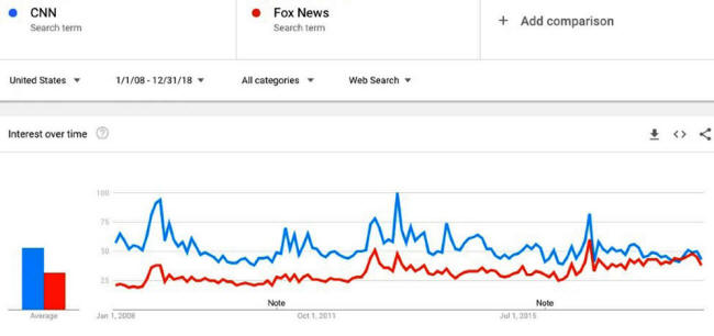
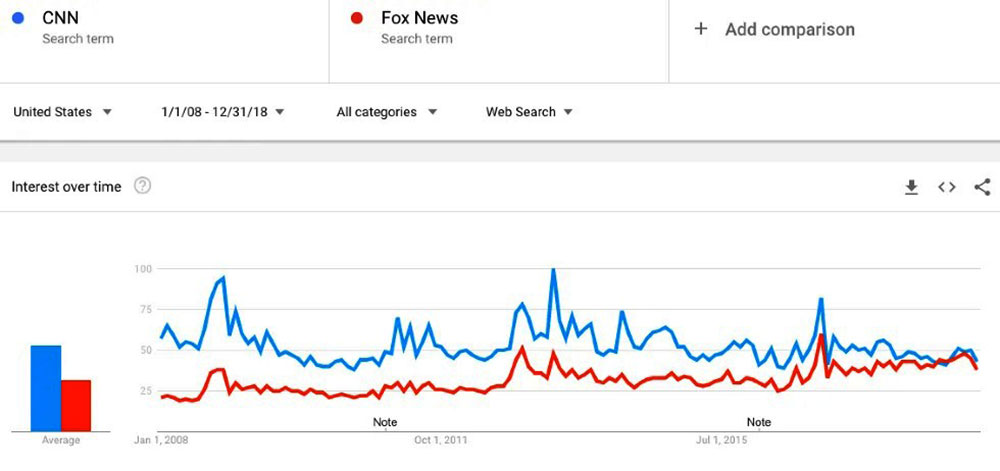
Image: Google Trends
CNN vs. Fox News search terms (200!-2018)
But what do the maps actually show?
Created by SICResearch,
they do show a huge evolution, but not of both cable news networks'
audience size (i.e. Nielsen ratings). The dramatic shift is one in
Google search trends.
In other words, it shows
how often people type in "CNN" or "Fox News" when surfing the web.
And that does not necessarily reflect the relative popularity of
both networks.
As some commenters
suggest:
-
"I can't remember
the last time that I've searched for a news channel on
Google. Is it really that difficult for people to type 'cnn.com'?"
-
"More than
anything else, these maps show smart phone proliferation
(among older people) more than anything else"
-
"This is a map of
how old people and rural areas have learned to use Google in
the last decade"
-
"This is
basically a map of people who don't understand how the
internet works, and it's no surprise that it leans
conservative"
A visual image as strong
as this map sequence looks designed to elicit a vehement response -
and its lack of context offers viewers little new information to
challenge their preconceptions.
Like the news itself,
cartography pretends to be objective, but always has an agenda of
its own, even if just by the selection of its topics.
The trick is not to despair of maps (or news) but to get a good
sense of the parameters that are in play. And, as is often the case
(with both maps and news), what's left out is at least as
significant as what's actually shown.
One important point: while Fox News is the sole major purveyor of
news and opinion with a conservative/right-wing slant, CNN has more
competition in the center/left part of the spectrum, notably from
MSNBC.
Another: the average age of cable news viewers - whether they watch
CNN or Fox News - is in the mid-60s.
As a result of a shift in
generational habits, TV viewing is down across the board. Younger
people are more comfortable with a "cafeteria" approach to their
news menu, selecting alternative and online sources for their
information.
It should also be noted, however, that Fox News, according to
Harvard's Nieman Lab,
dominates Facebook when it comes to
engagement among news outlets.
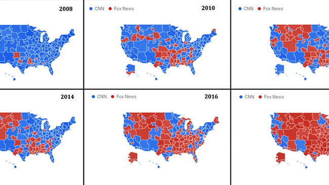
CNN, Fox and
MSNBC
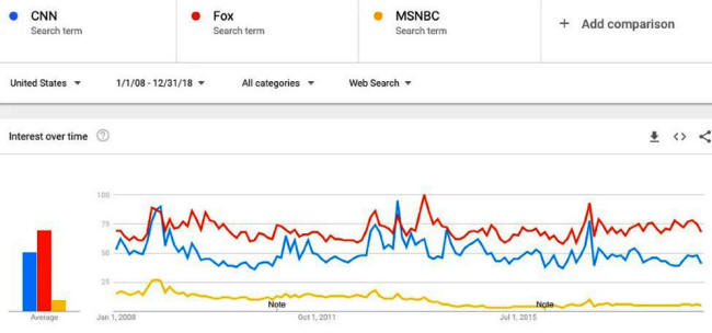
Image: Google Trends
CNN vs. Fox (without the 'News';
may
include searches for actual foxes).
See
MSNBC (in yellow) for comparison
For the record, here are the
Nielsen ratings for average daily
viewer total for the three main cable news networks, for 2018
(compared to 2017):
And according to this
recent overview, the top 50 of the most popular websites in the U.S.
includes cnn.com in 28th place, and foxnews.com in... 27th
place.
The top 5, in descending order,
consists of,
-
google.com
-
youtube.com
-
facebook.com
-
amazon.com
-
yahoo.com,
...the latter being the
highest-placed website in the News and Media category.
|