
I spent the evening comparing USHCN V1 and V2 graphs, and discovered a huge discrepancy between their V1 and V2 adjustments.
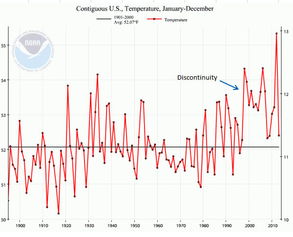
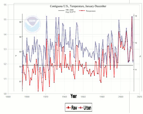
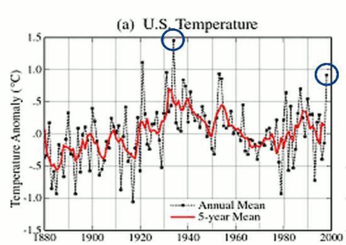
This is their current US graph. Note that there is a discontinuity at 1998, which doesn’t look right. Globally, temperatures plummeted in 1999-2000, but they didn’t in the US graph.
Climate at a Glance - Time Series
It doesn’t look right, because they made a huge change going from USHCN V1 to V2.
In V1 they adjusted recent temperatures upwards (thin line below) and made little adjustment to older temperatures.
But when they switched to V2, they started adjusting older temperatures downwards, and left post-2000 temperatures more or less intact. This created a huge jump (greater than one degree) downwards for all years prior to 2000.
You can see what they did in the animation below.
Blue line is thermometer data.
Thin red line is V1 adjusted.
Thick red line is V2 adjusted.
Thermometer data and V2 data are normalized to the last five years, creating a small offset on the Y-axis. They created a significant warming by reversing polarity of the adjustment in the pre-2000 years.
How did a peer-reviewed positive adjustment suddenly become a negative adjustment?
A big clue has been right in front of my eyes all along.
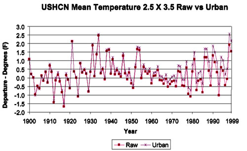
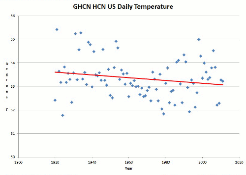
Note that measured data below shows that by 2008, temperatures were back down to the 1989 level. But in the NCDC data, 2008 is half a degree warmer than 1989.
Bottom line is that there is clearly a huge error in the USHCN adjustments which has added a non-existent one degree hockey stick warming to the official US temperature record, and I now know just where to look for it in their code.
FOIA time
This is what the adjusted temperatures would look like, without the error. Ignoring the fact that the adjustments themselves are probably not valid.

NOAA made a big deal about 2012 blowing away all temperature records, but the temperature they reported is the result of a huge error. This affects all NOAA and NASA US temperature graphs, and is part of the cause of this famous shift.
According to USHCN 1 docs, the total adjustment is supposed to be about 0.5°F upwards, and flat after 1990.
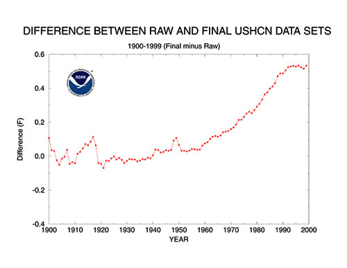
But in USHCN2, the adjustments are much larger, downwards, and actually accelerate after 1990. The USHCN2 adjustments are supposed to be similar to USHCN1, and the TOBS adjustment is supposed to be identical.
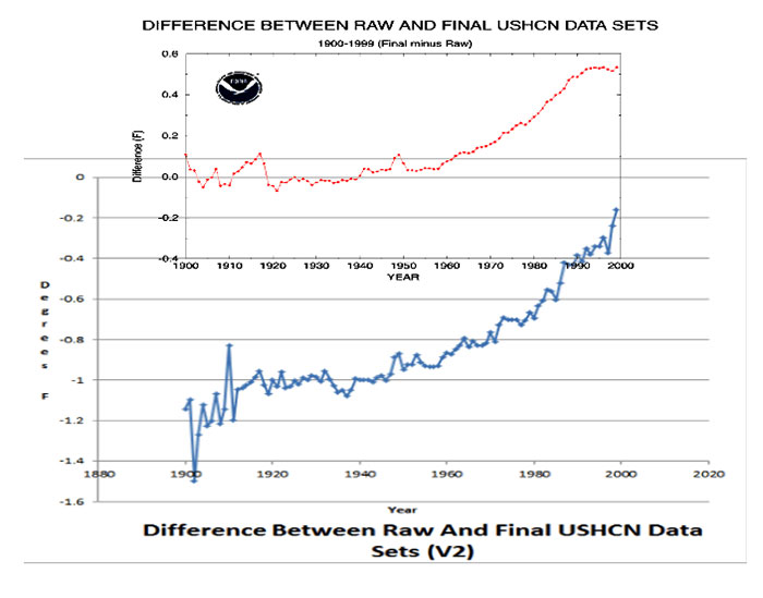
This graph shows the USHCN1 (red) and USHCN2 (blue) adjustments at the same scale and offset. Note that the adjustments went from being positive in V1 to being negative in V2.
Also note that in V1, the adjustments went flat after 1990, and in V2 they rise exponentially after 1990.
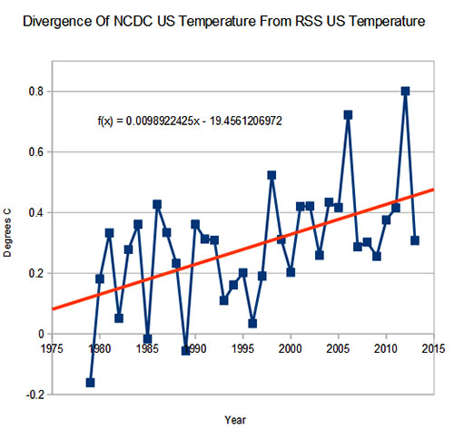
RSS satellite temperatures show that by 2008, US temperatures had cooled down below what they were during all of the non-volcano years of the 1980′s and 1990′s.
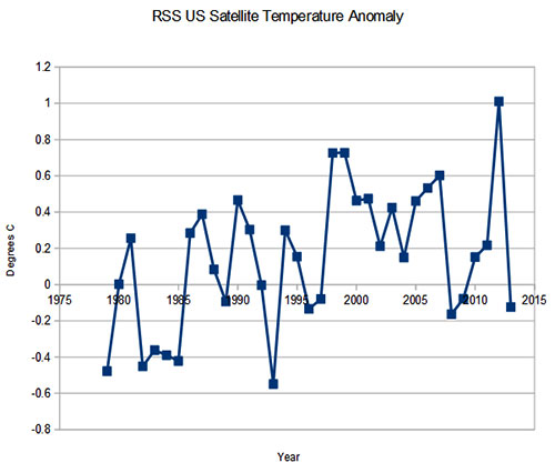
RSS does not show the NCDC discontinuity, and NCDC is diverging from RSS at almost 1°C/century
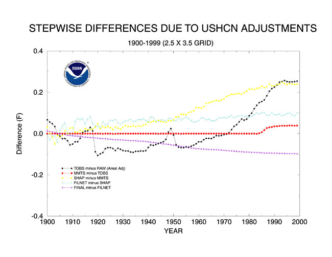
Here is an animation of the complete set of USHCN2 adjustments, which turn a 90 year cooling trend into a warming trend.
Visualizing How USHCN Hides The Decline In US Temperatures | Real Science
According to the USHCN2 docs, the TOBS adjustment is supposed to be almost identical to USHCN1. But in the actual data, it isn’t even close. Points to a software bug.
The U.S. Historical Climatology Network Monthly Temperature Data - Version 2
There are additional problems evident in the docs.
The USHCN2 docs show TOBS continuing up after 1990, but the USHCN1 docs show TOBS going flat after 1990. USHCN1 showed 2ºF TOBS, but USHCN2 shows 2ºC TOBS.
It is supposed to be the same adjustment, and according to USHCN1 docs should have gone flat after 1990 - but is almost double the USHCN1 adjustment.
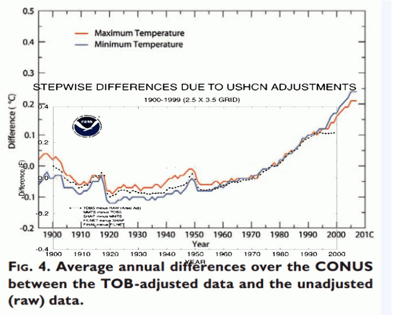
The next graph shows the actual implementation of V2 TOBS vs. the spec.
The implementation (thick blue line) is offset down from the specification (thin red and blue lines) by about a quarter of a degree. How did a positive adjustment after 1980 turn into a negative adjustment? Fuzzy math?
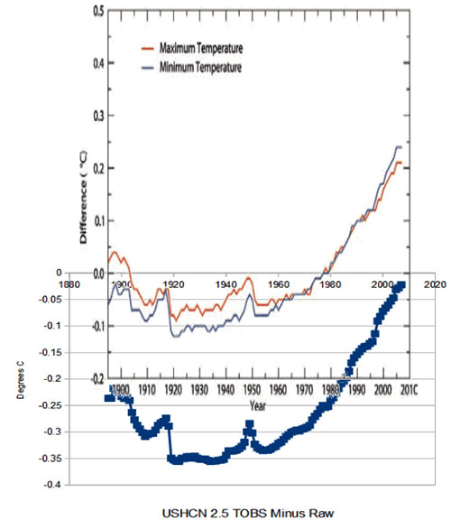
The actual TOBS adjustment above was calculated by subtracting,
the raw temperatures ushcn.tavg.latest.raw.tar.gz
from the TOBS adjusted temperatures ushcn.tavg.latest.tob.tar.gz
Bottom line is that the NCDC US temperature record is completely broken, and meaningless. Adjustments that used to go flat after 1990, now go up exponentially.
Adjustments which are documented as positive, are implemented as negative.